Here are a few of the common questions that have been coming up regarding navigation to certain features in Informant 5.
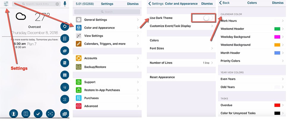
Where is Settings? How do I Turn Off “Dark Mode”? How do I change colors?
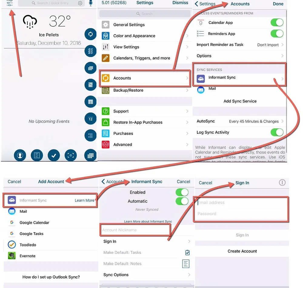
How to Setup informant Sync:
If you have an existing Informant Sync account you can setup your informant Sync account in Informant 5 to Unlock the full app.
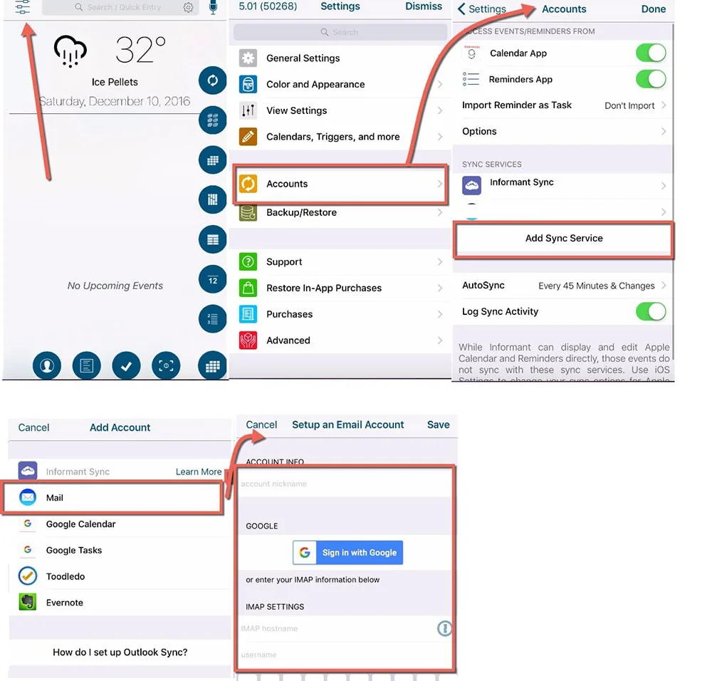
How to Configure your Email Account.
Requires IMAP. You may need to ensure that IMAP is enabled in your actual email account. IMAP may not be enabled by default in many GMail accounts.
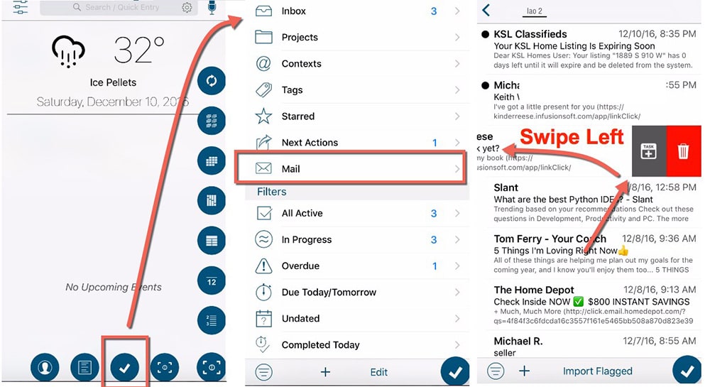
Where to find and how to use the email to task feature
Once setup, you access your emails from the task screen. To turn an email into a task, swipe left.
How to get a FREE Trial of Informant 5:
To get a free 7 day trial, select “Purchase Monthly” subscription. This will give you up to 7 days free.
iTunes manages all billing of the Trials.
Please note that the Purchase Quarterly or Purchase Annual options DO NOT have a free 7 day trial period.
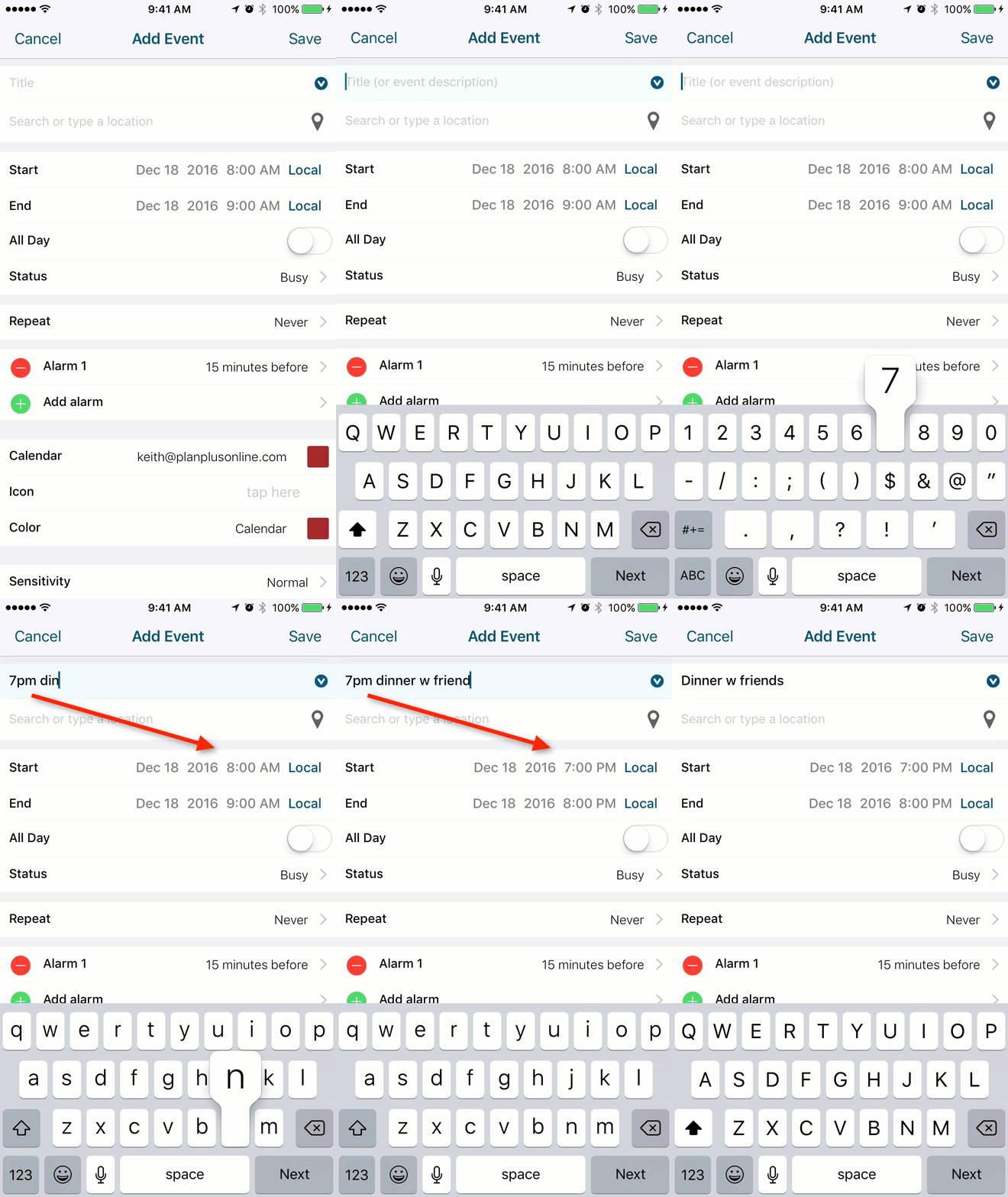
Quick Entry:
Swipe left to activate in Event Title. Type in the hour of your event and the time selector will capture it from the Event Name.
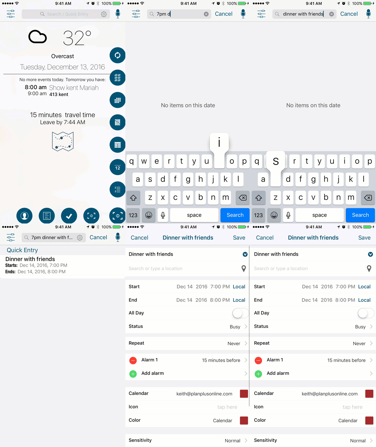
Quick Entry From Focus View:
Type in the hour of your event and the time selector will capture it from the Event Name.



How can I add a new task from the task screen? Every time I press the plus sign I’m taken to a filters prompt.
I noticed that as well.
I don’t know if that is done by design or by error
It’s strange how you have to go into one of the folders just to add a task on the task screen
mehill,
I believe you are on the view summary page so the “+” button on that page would create a view. If you click into one of the views such as: All Active, you will see a list of tasks and a + button there. That button allows you to create a task.
I’ll admit, I got caught off guard by that one also. I’ve mentioned that to Chris & Alex and I’m sure it could land on their que.
Is adding a filter more important than adding a task on the task screen
I use filters but not as much as adding a new task
This is another example of needing more taps than was required in the previous version
Thanks Keith, I did know I could enter a task on those other pages, as well as from my Focus view, so I guess the answer to my question is, “you can’t create a task from the Task screen”? Is that correct? The screen that pops up when I click on the checkmark button is what I’m calling the Task screen.
I don’t mean to sound snarky, but I’m not sure if you answered my question or not.
@mehill: both you and Keith are right
(1) As you know, in PI4 you go on the “task screen” tapping on the little icon with a checkmark (and count of overdue tasks, which has sadly disappeared”. When you get there you see a list of task and header like “All Active” telling you where you are (this has disappeared as well, and I’m very upset about that). To add a task you tap “+” on top right. If you want to change the tasks you see, you tap the three lines on the top left, a “menu bar” appears. This menu bar covers the screen almost entirely and has all choices like “Inbox”, “Projects”, “Contexts”, etc. It also includes the Smart Filters. To add a new smart filter you tap on the circled “i” next to the header “Smart Filters”
(2) In PI5 things have changed dramatically for the worse. You tap on the icon with a checkmark and you see a list of tasks. We’ve sadly lost the header to tell us where we are, it got substituted by a “ribbon” which has, for example, “All Active” underlined (too bad “All Active” soon disappears as you scroll the ribbon”. If you want to add a task you tap the “+” at the bottom of the screen. If you want to change what you see (as in point (1) above), you tap the “<" sign at top left. This time you don't get a "menu bar" as above, but a new screen with "Inbox", "Projects", "Contexts" etc (this is true on my iPhone, on the iPad this is still a bar occupying the left part of the screen". When this view is enabled, the "+" sign at the bottom of the screen changes purpose: instead of letting you add a new task, it allows you to add a smart filter. This must be one of the "context sensitive" controls, but for me it's very confusing, especially because if you leave task view without choosing anything, when you ho back you're still presented with that list rather than the tasks, and you MUST leave it before being able to add a task!!!
I really don't like all this! Apart from issues outlined above:
(1) It is totally unnecessary to give such prominence to "add a new smart filter" button. Smart filters are something you spend some time setting up one day, and then you are basically done, you don't fiddle with them on a daily basis, so much that you need to have a dedicated button always present. This is another instance in which, in order to show beginners that a feature exists, all other users must swallow a worse and more cumbersome interface
(2) On iPad, I found it very useful to have the left bar (with "Inbox", "Projects", "Contexts") always on, on the left part of the screen, with the list of tasks on the right part of the screen. Now THIS IS NOT POSSIBLE ANY LONGER. Alex says he likes to to focus on tasks without further clutter, but it would be nice to offer users the option to decide what to do. For me, you don't need a full iPad screen for listing tasks (their names are always relatively short anyway because I need to see them and make sense of them also on the iPhone), so the iPad screen with the list of tasks looks uselessly empty, and it gets more distracting to change, say, from "All Active" to "In Progress"
For the record this is NOT an example of where it takes an extra tap in PI5 because PI4 had no “new” button there at all – for tasks or filters. The idea was we did have the (I) button next to Smart Filters to create/manage smart filters and I felt that since Smart Filters were such a powerful part of Informant, that I’d make it more accessible in that screen. So this is actually one less tap for that purpose.
To be clear in PI4 you had to go into a filter to create a new task as well. In PI5 we added the new filter button.
That said, we do hear the feedback.
The more I use PI5, the better I like it. There are a few things that have taken some getting used to, but I’m coming around. The 5.01 fixes have helped. Mostly, I have noticed a significant improvement in sync time through Toodledo and Google. It is much quicker, though I’m not sure what fixes addresse this. As I said earlier, trusting the developers based on past experience, I want to give it a little time and already see marked improvement.
Regarding the adding of tasks from the Task view, I agree that his is counter-intuitive and the adding of smart filters does not need such prominence. There is already a quick way to add from this screen, by clicking the Smart Filters header bar circled “i” and tapping the plus sign. I would rather have it tack 2 clicks to ad a smart filter and add a task above e opposite ( as currently designed).
Again, my complaints are minor compared to overall usefulness of the app and I want the criticism to be taken as constructive from an end-user perspective. Keep up the good work!
I hate autocorrect. I meant to say that I would rather have it take 2clicks to add a smart filter and 1 to add a task than vice Versa.
The place for ideas and not bug fixes.
The number one idea (on that site) is revert to old date picker. And yet to be noted as acted on.
I offer compromise. Use the new (pi5) picker for the year, positioned just below the (pi4) calendar style date picker. This is far better than the old jump to another screen (-/+) picker. And it’s all on the same screen.
If you like the sound of my song, please sing out loud!