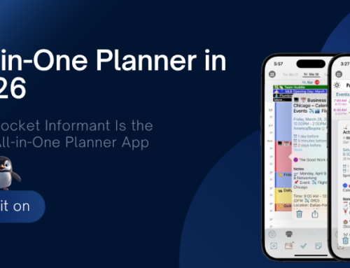
 One thing that I think is cool about Informant 5 is our new iOS 10 Rich Notifications. When you get a notification for an event or task – you can force touch on a notification and get several new snooze options and a cleaner looking notification showing real-time start/due time duration from now. Also, if your notification has a location with a coordinate – we’ll show a map and the event location.
Its not a big thing, but its one of the many small things that makes Informant 5 enjoyable to use.
*Force touch available on iPhone 6s, 6s+, 7, 7+


PI4 should have these features, along with Force Touch.
Look, I wouldn’t even have cared if you moved PI4 to a subscription model to get access to updates. I’m already paying for PI Sync. I get that companies need recurring cashflows to continue to operate. The thing is that in trying to fix a business problem, you’ve now created a product and design problem, which is much worse. I’m guessing this happened: you realized that you needed a “new and flashy” version of PI to be able to introduce the new revenue model. So you went all in (with a touch of group-think) with a new design which is admittedly “different” but not better. The new additions are only marginally useful, and the core experience is much worse.
Really, it would’ve been so much better just to stick with the old interface and keep on improving on the core (bug-free) experience + added functions like iOS10 Notifications etc, on a subscription model. Customers might’ve been upset about the pricing for a while, but as long as the product provides a benefit, they too understand that there is value for both them and the company to pay the subscription.
But the problem now, for users like me who realize that the PI5 fundamentals are likely quite unsalvageable, is that we face a new pricing model AND a poorer experience. So either we stay on PI4 for a while until it dies by attrition, or we switch platform. But paying subscriptions for a product that is fundamentally less value – no, that will obviously not work.
My suggestion is that you either go back to the PI4 interface for PI5, but keep some new features like emails (not that I needed this), in order to consolidate the experience that previous customers originally signed up for. Or if you want to keep PI5 as it is, keep supplying basic iOS-dependent functionality updates like rich notifications and force touch to PI4 that should be provided anyway because they are *Apple*-driven system improvements; but let people who want the extra *Fanatic* functionality like emails and triggers get PI5 if they see value in that.
Isolating force touch and rich notifications to PI5 is a cheap tactic IMO. Apple provides these platform fundamentals for via the OS, including Siri integration, which should be part of the base experience as an iOS user/customer.
But there is no chance in hell that I’m going to use PI5 as it stands. It’s really a bit of a “Frankenstein’s monster” you’ve got going with that app. Yes, I’m going to be moderately rude here, because I think you aren’t getting the message from users.
These are just my thoughts too. Thanks for writing them down 🙂
Thes is exactly the sort of things that I consider valuable improvements. More work on such “small things” and less on big ones would really be appreciated
When PI5 stops crashing on my iPhone and iPad, I will look forward to this feature. But for now, I am using PI4 until a more stable version of 5 is available.
Oh dear.
As a long time user (early pocket PC onwards) and a current sync subscriber I am very disappointed.
PI5 crashes on my iPhone 6 when trying to save an appointment so useless so far. Task view ribbon is horrible & slows down input and usage. As others have said, switching view modes now requires 2 taps instead of one.
Sync still will not sync colour schemes, icons etc across devices, there is no logic filter in tags, templates will not save the option to invite another person to an appointment.
I understand the business decision re pricing but would love to see some uptake / response to customers requests as it seems you are not understanding customer needs currently.
At the moment I will stick with PI4 until my sync subscription ends & then may have to look to alternative platforms.
@Niklas – we definitely hear you. We’ve been listening to and internally processing the feedback on the UX changes in I5. I’m sorry you feel like we haven’t been getting the message…just know that there are a handful of us and thousands of you – so coming off of a major release, we can’t always respond to everyone as thoroughly as we’d like. But rest assured that your voices are being heard and we’ve had plenty of internal conversations / planning around it all 🙂
As far as updating PI 4 with some things like Rich Notifications, unfortunately that’s not quite as simple as it might seem. PI 4’s codebase has roots going back to like iOS 4 days. As part of I5, we cleaned up a ton of that code (especially in how we deal with UI stuff). This has nothing to do with how the UI currently “looks” – it’s all about how we actually do it under the hood. It was a lot of work – but the “under the hood” modernization sets us up really well for iOS 10+.
But at this point, to try and cherry pick some specific new features and integrate those changes backwards into the older PI 4 code would be a TON of wheel spinning (plus, we’d have to set up a development machine with an older operating system and older version of Xcode – Xcode 8 won’t build PI 4 at all…Apple made the decision to drop support for Swift 2.2 in Xcode 8, and PI 4 had a ton of Swift 2.2 code in it).
So, I5 is the future…and I’m convinced that we’ll be able to address your UX concerns. Like I’ve said in a couple other places, we took a few risks with the UX and in some areas it paid off, there are some areas where WILL pay off after a few specific improvements, and there are perhaps a couple things we need to rethink a bit. Some things are purely subjective when it comes to UI, but there are other tangible and practical concerns being raised that I think can definitely be addressed.
In short order, here are the priorities for I5:
-Focus solely on stability and “broken stuff” for a couple “quick” releases. If it’s approved in time, you should see 5.01 hit the App Store this week and that addresses most of what we saw come through support.
-Possibly do a release that makes tangible improvements to (but not necessarily huge changes to) specific concerns that people have with some of the UI changes.
-Make a few more significant UI improvements that I think will address the final set of concerns people have.
Hope all that helps clarify where we are currently. As always, keep your eye on the App Store for I5 updates.
That’s great to hear you are listening to customers and fixing things. Since almost all of the UX changes in PI5 are questioned by users: extra taps to switch views, non-intuitive & anti-productive date picker, non-customizable magic bar, distracting animation, I’d like to encourage you to review the design philosophy for PI5 that what made you gave eye candy higher priority over efficiency, why these issues were not discovered in design and beta test phases.
Agree. Form should follow Function.
[…] iOS10 Rich Notifications […]