Informant for iOS 5.40 is ready for release. This blog post will give you a few insights of what to expect.
Expected Release Date: 7/18/2018
NEW & IMPROVED:
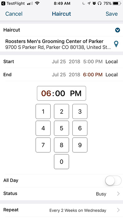
• New Time Picker! By popular demand, the time wheels are gone and you now have a super-efficient numerical keypad to enter the time of your events. 
• On the Date Picker, the month selector now wraps around between December and January. When it wraps around, it automatically increments or decrements the year as appropriate.
• The Date Picker now loads significantly faster
• The I5 Date/Time picker is now used everywhere throughout the app (replacing several areas that still used the legacy PI4 Date Picker). Aside from looking great, this also resolves several issues including the date/time picker popover being too wide on iPhone SE and some year selection problems on the Buddhist calendar.
• New Pure Black theme! It takes our “dark” theme one step further. This theme was designed with the iPhone X’s OLED screen in mind – it looks great and saves energy!
• New view picker icons
• The iPhone X view picker no longer uses a 2nd row of buttons for the different calendar options – simply force touch on the main calendar icon to see them (or if you are already on the calendar view, a simple tap on the calendar icon will work as well)
• Triggers are now alphabetically sorted
• Informant Home screen now always shows the very next event (whether it has a location or not)
• Restoring or deleting a backup file now confirms with you first
• You can now share Informant with a friend and give your friend a FREE month!
FIXED
• Fixed issue where you couldn’t dismiss the search field once you started filtering the task or notes view.
• When doing a search on iPhone X, the search results would remain active even when collapsing the drawer
• Fixed issue where Informant might describe certain Apple Calendar events as repeating on the “0th Saturday” of the month
• Fixed issue restoring a backup from iCloud Drive
• Fixed issue where tag filtering might not work properly in non-English languages
• “Inbox” wasn’t being localized in the task editor
• Fixed issue where after restoring purchases, Informant Sync might repeatedly fail with an error of “Failed to send IAP receipt”
• Fixed issue where you sometimes might see two “Dismiss” buttons in the Settings view on a Plus-sized phone
• Fixed a few iPhone X specific layout issues
• Background App Refresh sometimes would get hung up and time out before it could finish
• Several internal & stability improvements


Very very nice. I love the new icons and the app seems to run much more smoothly. Even scrolling in Agenda on my X is buttery smooth.
Love this update.
A proud parent rejoices listening to remarks made by others about their child’s achievements. He or she does not take the stage to extol their child’s virtues.
It will be good to finally see a decent Time Picker, but most importantly when is the new View Selector / Main Navigator coming? It has been announced on a blog post on April 16, exactly THREE MONTHS AGO! I couldn’t care less about new icons.
Gennaro,
We did push out a new view picker in beta 3 but we decided to pull it back before the final release. We felt that the amount of space that the view picker was taking up was just too much in the end. We are going back to to the drawing board on that one a bit. Rather than continue to hold up the entire 5.4 release, we went out with the Time Picker changes and numerous bug fixes etc. Stay tuned for the view picker changes on iphone 4-8. BTW: iPhone X has the new view picker because it has more vertical space and it worked there.
Thank you for clearing that up Keith. I hope it won’t take too long.
Excellent! (and FINALLY)
After almost endless waiting time an update!
Positive:
I like the whole black theme, looks really good. Necessity? Well!
Appointment entries can now be entered again using the virtual numeric keypad.
Neutral:
The new icons are rather so lala. Okay, but not really necessary.
Negative:
I find the color of the focused icon screaming. Allegedly display errors on the iPhone X have been corrected. I’m just wondering: Which one? The notch is – especially in landscape mode – still not considered and conceals information. For the time entries for reminders, disastrous wheels are still used – pure inconsistency. And – of course – still the financing model to run away!
Somehow – especially after such a long time – this is still not enough for a third star and certainly not for the extension of the subscription!
The notch isn’t working well indeed in landscape modus.
The notch blocking the view.
(The time picker is great. Just like the wrapping around of the month selector between dec/Jan)
He’s right about the time picker in task alarms–it’s still the old rotary picker. Missed one!
This (v.5.40) is apparently the “final release for Informant 5 for iOS” (according to a Tweet by Fanatic).
Guess this means that all those who paid to “own” Informant 5 will have to pay again to “own” Informant 6.
I’m afraid we will have to wait for next year before seeing the navigator improvement announced three months ago, or a solution to several annoying bugs
m_g58,
This is NOT true. There is no truth to your comment. There will be a 5.41, 5.42, etc….
The word “Final” was used (and quickly removed) from a Facebook post referring to the Final build for v5.4 being ready in comparison to the prior beta builds (beta 1,beta 2,beta3) that were not final releases.
Aah, a case of saying “would” when you wanted to say “wouldn’t”.
You might want to correct Fanatic’s Twitter page as well.
I’ve been waiting for ‘tags’ to return when creating new event…I really thought this would be it…
Do I need to pay for that feature?
Just curious, if you wouldn’t mind explaining that.
Also, very nice implantation of time selection. But like many, we’ve been waiting for so much more at this point – let’s hope.
Is there any chance of getting ‘tags’ back?
Is it a ‘paid only’ feature?
Please respond.
Tags are available for events just like they always have been – but they don’t show for Apple Calendar events (the same was true in PI4 as well).
Thanks Chris…now I see if I change the calendar it’s attached to…tags are there.
It brings up a new thought that makes no sense to me…it is a ‘sort of’ paid feature. It only works with sync account?…not a ‘read’ account? 🤔
As others have noted, the revised time picker is a significant improvement over what it replaced; however, there seems to be one glaring deficiency that represents—for me, at least—a huge step backward: there is no “Today” button. It seems impossible to return to “today” easily. Am I missing something? If not, why was this functionality removed? Does nobody else use it?
Definitely. It’s been an inconvenience since I5 was released. Perhaps not quite as much as other issues mentioned by various people over the last few months, but still a glaring omission.
erik, what screen are you on when you can’t return to today? There is a today. for example, on the 30 day view, it is a small dot between 2 arrows at top right of the page.
He’s talking about the date/time picker specifically (eg while editing an event). (Useful, for example, when copying an event from the past, then while editing it, quickly set the date to today)
Ren is correct. There should be an easy way, in the time picker, to return to “Today”. In the previous iteration, it was present in the iPhone (5s screen size), albeit counterintuitively: it only appeared in landscape mode! Not optimal, to be sure, but certainly better than no way to return at all. It was always present on the iPad.
Hey Erik – it exists, it’s just not overly obvious. If you force touch or long-press on the month calendar of the date picker, it will jump back to Today.
Chris— Thank you very much for the explanation. I have tried it and it works. Clearly, I was “missing something”; however, your comment that the solution is, “not overly obvious” suggests to me that there may very well be many more of these kinds of opaque ways to access functionality. Time and again, users have asked for a manual and the response has ben some variation on “manuals go out of date too quickly” (which, actually, is probably true). At one point WebIS/Fanatic produced, videos explaining how to accomplish certain tasks. Will this effort continue?
I agree with Erik that the force press approach (while “elegant”) is positively obscure (“not overly obvious” doesn’t begin to describe it). This fails the “intuitive and easily discoverable” UI standard.
While we now know what the devs did, I feel that there needs to be a discussion on the dev team about the “intuitive and easily discoverable” UI approach versus “how can we use this cool UI thingy to show how clever we are” approach. Or maybe it was just the “shit, we forgot that–how can we shoehorn it into this release” approach?
Chris,
this is the least intuitive control I could think of. It’s good to know it and it works well, but I’m really surprised to see such an implementation when one of the reasons to leave the wonderful scrolling main navigation / view selector of PI4 was that it was not very intuitive and many people wouldn’t realize it could scroll…
The one feature I am wishing for is still missing. I want to be able to simply copy a calendar entry and then paste it as many times as I want in others dates in the calendar, everything unchanged except for the date.
An old version of Informant I had years ago for a HP device worked this way. And this was by far the quickest way to set up my monthly schedule of recurring work events. Why don’t calendar developers understand that a lot of us have monthly schedules of this kind?
You can do this currently. For example, in tasks, force touch (long hold) the task. a round pop-up menu will appear. You can copy/clone the task/ event.
Am I the only one who gets interrupted, often, with a pop up asking me to rate and review this app that I paid a lot of money for and have already rated and reviewed?
A tip for marketers, being contacted by a company, asking me to give a review or do a survey ALWAYS negatively affects my appreciation of their product or service. And if you still think it’s a good idea to ask, at least send me an email instead of popping up in my productivity app asking me to stop what I’m doing and rate your product. Especially since I’ve already given a review. I guaranty you liked my previous review more than you like the current one that you solicited and finally received after I got annoyed and thought a new review would stop the pop-ups (it didn’t stop the pop-ups by the way, which now prompted this negative comment on your blog).
Sadly, you are not the only one targeted.
I recommended the previous incarnation of Informant to more than a dozen colleagues who paid for what they (and I) assumed would be long-term access to features other than Informant Sync. The very few that continue to use the App have made it a point to express their irritation on constantly being reminded to rate and review I5.
This might explain the disconnect between the number of ratings and reviews. Users probably want to get the pop-up to go away for good and end up rating the App without a supporting review. I wonder if people who rate the App with fewer stars receive more frequent pop-ups and in the hope that they might preventing incessant reminders, give it a higher rating.
Sadly for me, m_g58, I’ve tried other apps and they didn’t work for me, so I feel like I’m stuck. I hate complaining and complaining, but I tried and failed to find a replacement that works for me.
So now, whenever something doesn’t work right (or in this case, works as designed but is focused on the company and not on the consumer), it makes me so sad. I miss the days when I loved this app instead of being annoyed by it. I know complaining won’t bring it back so for the most part I stay away from this blog, but sometimes I can’t help it.
mehill, I’m EXACTLY in the same situation as you: I loved this app up to 4, I strongly dislike 5, I can’t find a valid alternative, I feel I complain too much but it’s in the hope somebody will listen at some point. The new View Selector / Main Navigation promised several months ago would be a decent step forward
mehill and Gennaro, Guess since I am not a “power-user” like the two of you appear to be. I have easily made the transition to CalenGoo. In addition to natural language entry that consistently works, I find that the floating event feature to be very helpful.
I tried CalenGoo but there weren’t enough features. I did like the layout though.
And I agree with you Gennaro, the View Selector would be nice, but personally I use a lot of parent/child tasks and checklists and I wish they weren’t so glitchy. Either they won’t stay “closed”, or they duplicate tasks, or instead of collapsing they show me completed tasks, or my child tasks don’t all contain the same formatting even though I created them all at the same time. It would be nice if, after all this time, it didn’t still feel like a beta test.
So is Fanatic still in the process of ramping up product development? I can imagine this still being in process; 18 months is really not that long for business changes. But my hope is that the promise of faster/better product updates is still a goal. I very, very much hope this last year is not the norm!
btw, I don’t want to come off too negative here. I appreciate the progress made and Informant feels a lot more trustworthy to me compared to a year ago. But it still has a ways to go.